You have a logo you like. It looks great on signage, business cards and on your website. But how do you make your logo work in a tiny app icon for smartphones? How will it look in a Facebook profile picture or in an Instagram feed? This is the relatively new branding-world challenge that doesn’t seem to have a definitive answer — how to fit your logo in something so small, yet still be recognizable and retain your visual identity.
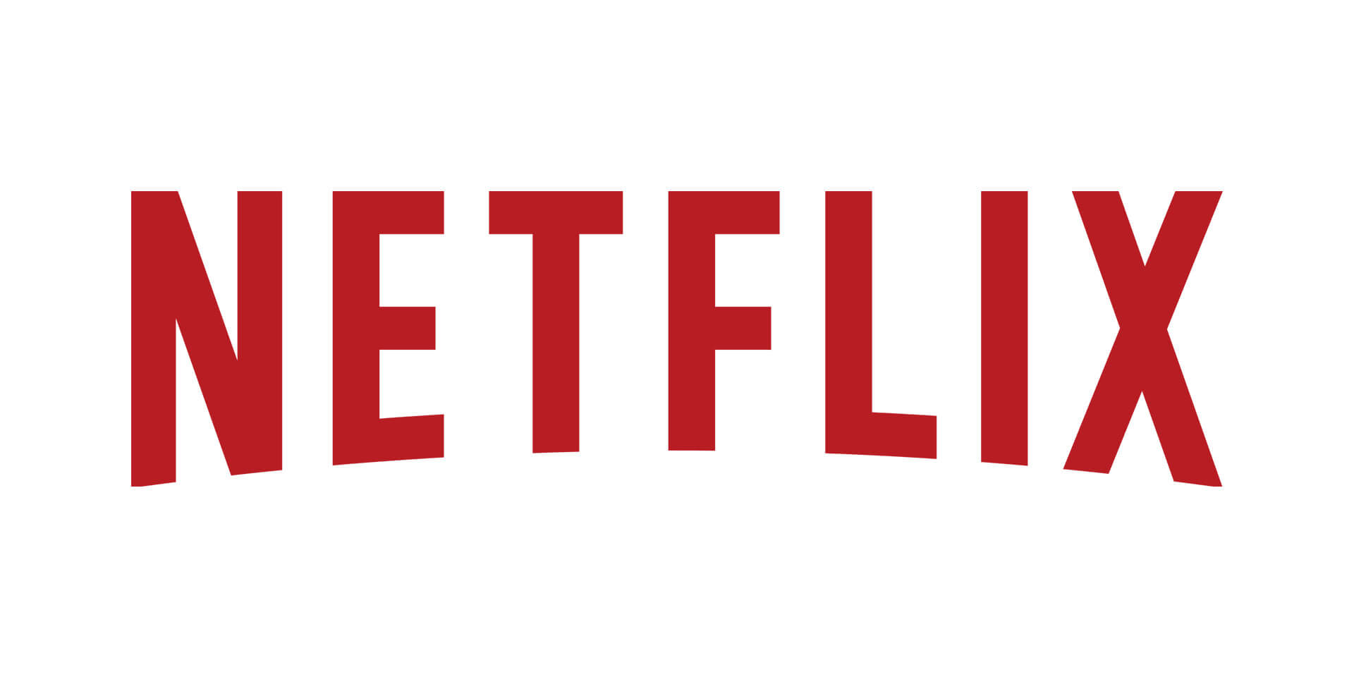
Faced with this problem, Netflix introduced a new variation of its familiar logo for use in social media. Public statements were quick to clarify that the official Netflix logo — red sans-serif type with a curve along the bottom — is not going anywhere. The well-known logo remains prominently featured on the website, print advertising and other elements of the beautiful visual identity developed just a few months ago by Gretel.
The new social media icon, however, is something of a visual departure. It’s a ribbon-like uppercase “N” that employs trompe l’oeil shadowing to create an illusion of overlapping depth. The original logo’s characteristic curve is cleverly referenced along the new icon’s lower edge.
Visually striking, the new mark appears to be the product of some good conceptual thinking, bringing to mind a strip of film or an Oscar-night red carpet. The initial online reaction is mostly positive, with Facebook “likes” outnumbering dislikes 10 to 1. (One angry commenter wanted to know why Netflix was spending time redesigning its logo instead of addressing more important things, like offering the 11th season of Supernatural)!
Does it make sense to make your customers work harder to find your content, especially after you’ve poured so much money into building your brand’s visual identity? Some have commented that the original logo worked quite well in social media applications, so you have to wonder why this significant departure was developed. A simplified version of the original Netflix logo may have been less exciting, but probably would have been a smarter brand solution.